MADE WITH LOVE.
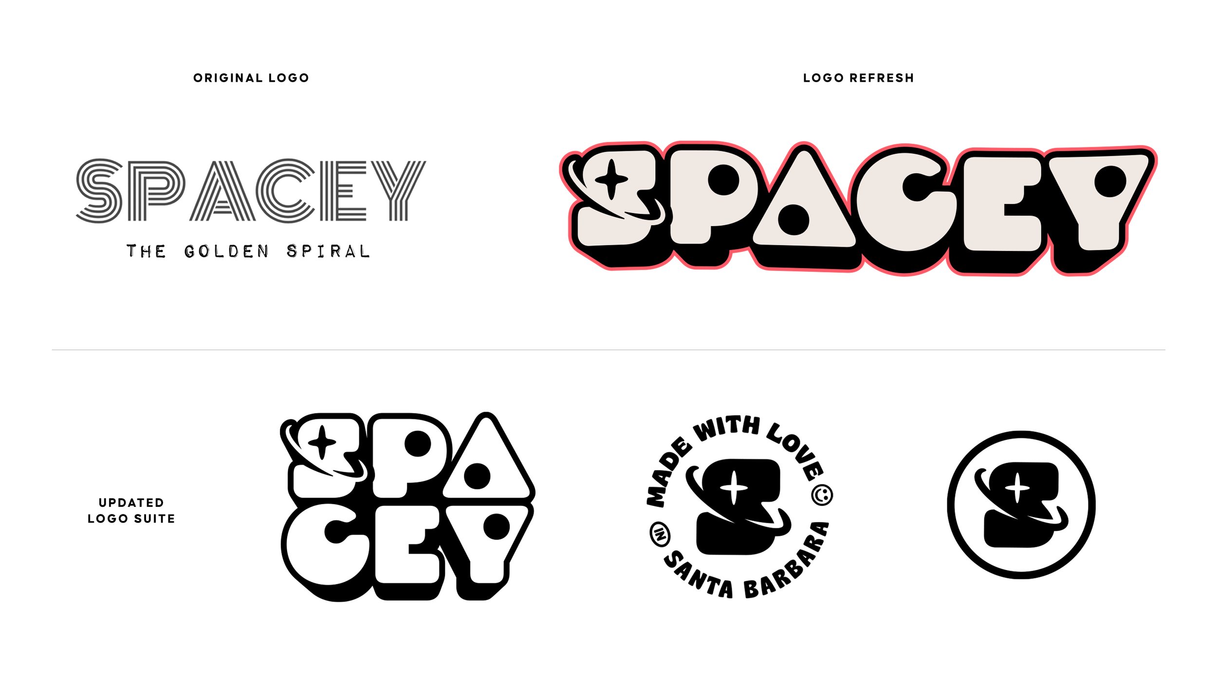
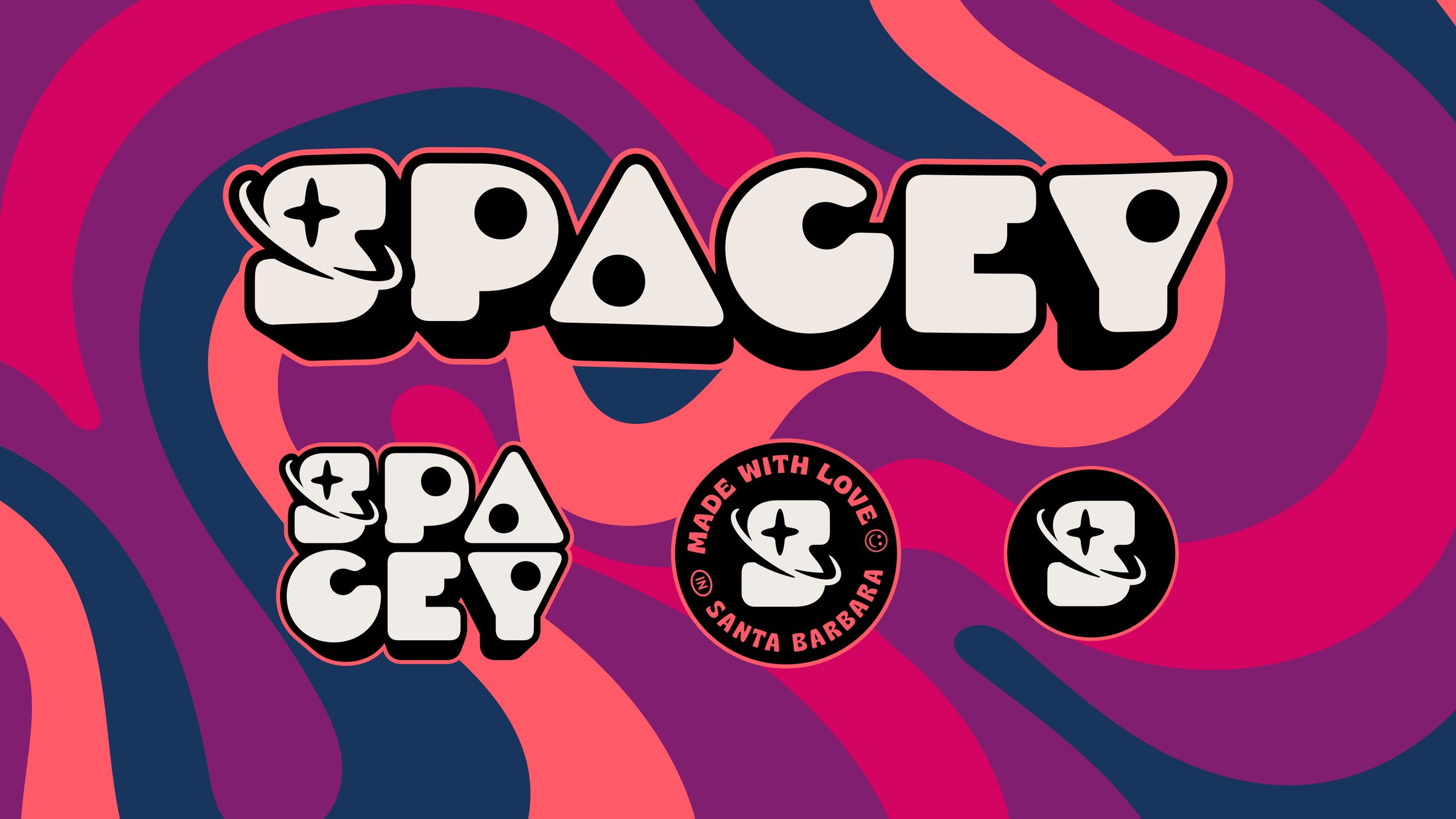
Spacey Snacks blends cosmic charm with wholesome goodness, offering a fresh take on grab-and-go treats. At the heart of the refreshed brand identity is a thoughtfully designed logo suite that combines playful, space-inspired aesthetics with personal symbolism. The orbit lines and star surrounding the "S" create a planetary silhouette, nodding to the circular shape of the snacks. Hidden within the wordmark, the inner dots of the "P," "A," and "Y" reference the star points of Orion's Belt, a subtle homage to owners Stacy and Sam’s son Rigel, named after a star in the constellation. Paired with the tagline “Made with Love in Santa Barbara,” the logo and badge speak to Spacey Snacks’ handcrafted quality and local roots.
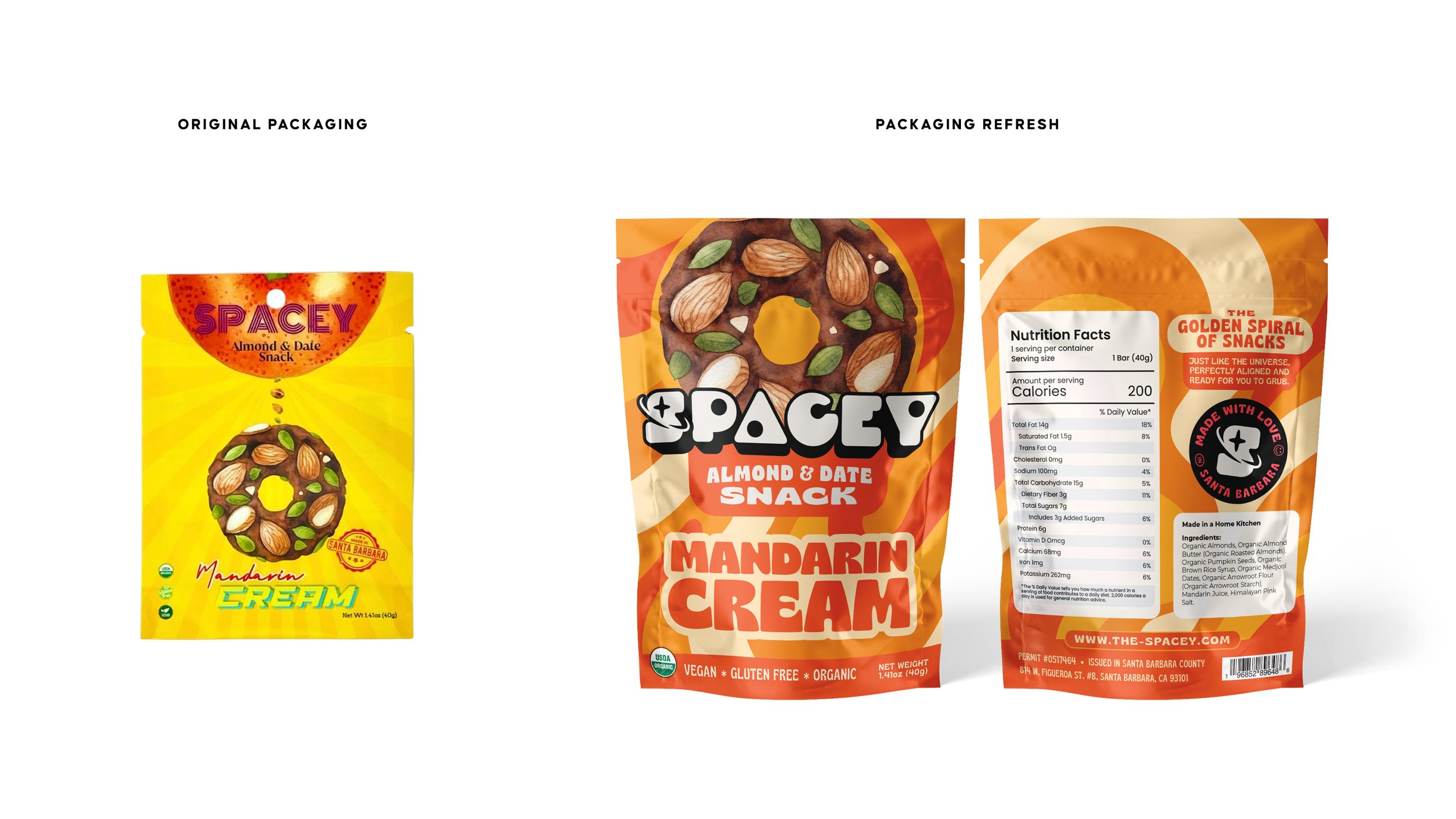
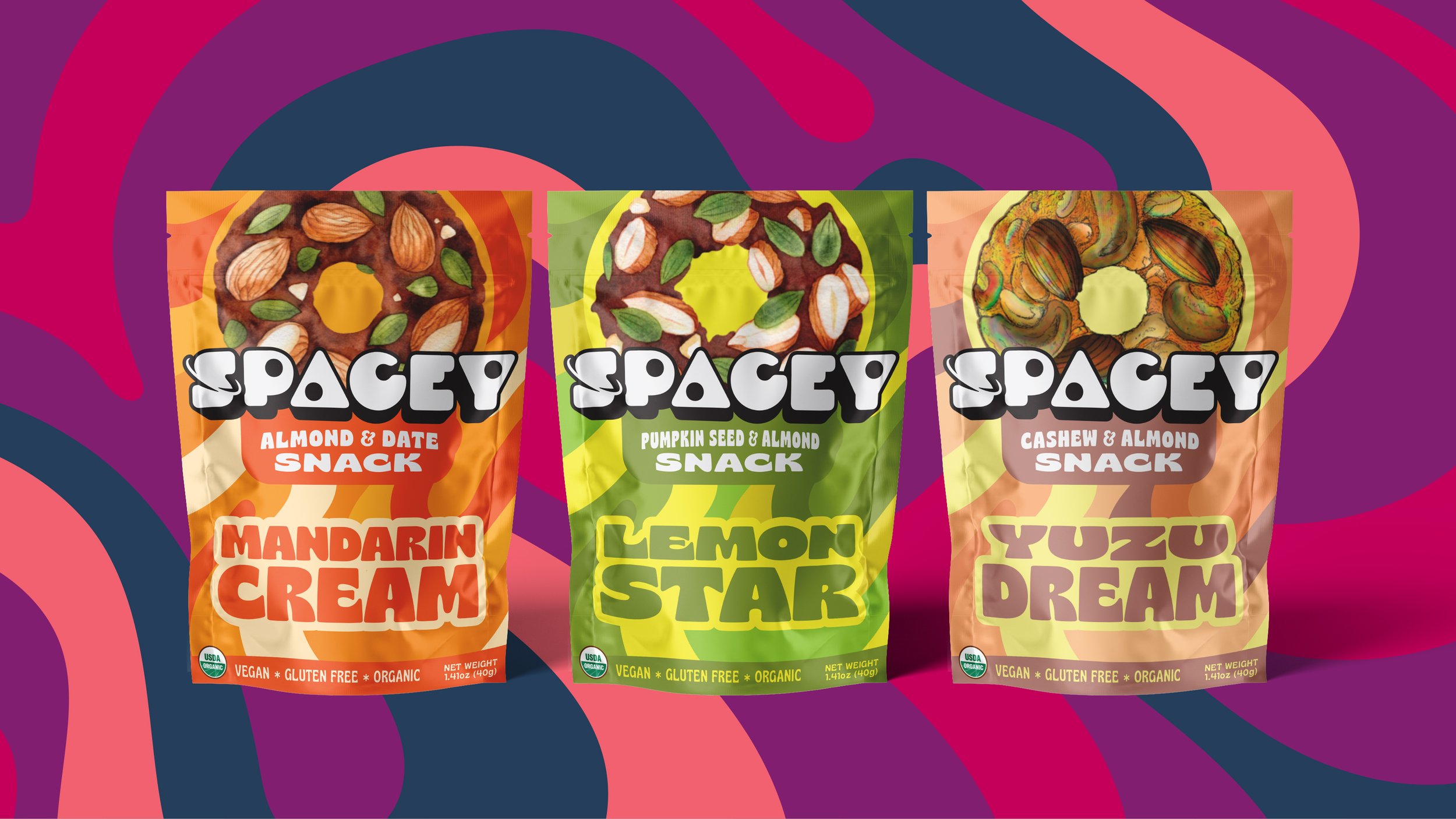
For the packaging suite, we built on Spacey’s iconic golden spiral illustrations, placing them front and center on the snack pouches. Combined with the new logo, playful typography, and a vibrant, appetite-inducing color palette, the updated designs celebrate the snacks’ flavor and health-focused ingredients. The result is packaging that feels as energetic and exciting as the people who enjoy them, standing out confidently on grocery shelves while staying true to Spacey Snacks’ mission of offering better-for-you options without compromise.
-
Logo Suite, Colour, Typography, Pattern, Copywriting
-
T-Shirts, Sweaters, Hats, Stickers, Skateboards,
-
Packaging, Stationery, Promotional Materials, Social Media Graphics